 |
| [Grabbed from Microsoft. Too lazy to make my own. Sorry.] |
Try searching Google for pictures related to "security usability". You will find quite a few pictures similar to the above.
Is that really the simple - and stupid - truth? Does it always have to be like that? I'd like to fight against some misconceptions in the area of security vs usability. Here's a very simple example; improving security by simplifying usability.
Is that really the simple - and stupid - truth? Does it always have to be like that? I'd like to fight against some misconceptions in the area of security vs usability. Here's a very simple example; improving security by simplifying usability.
So, I'm at Stavanger airport, Sola. as you can see from my iPad screenshot below. They offer free Wi-Fi, just like most other airports in Norway does today. A captive portal over http, where I select "Gratis Wi-Fi". You have probably guessed by now what that is in English.
Earlier the airports had these look-alike business cards lying all over, with seemingly random usernames and OTPs for 1 hour of free access at a time. I guess after printing tens of thousands of those, they realized it could be done without paper. You know; paperfree office, save the rainforests and all that stuff. It seems as they have killed off most of the papercards, and replaced it with usr/OTP sent by SMS registration to your phone. Saving money, while enabling pretty good tracking of who surfs what, if needed. You never know, somebody could tweet "We're going to destroy Oslo" or something.
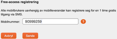
So you just click on the big icon to get to the "Free-Access registrering" page. Forget about the mix of english and norwegian language on the same page, people will probably understand it anyway:
Enter your cell phone number. Ah. Easy. I'm not completely dumb, so why on earth would I click that question mark icon out there on the right? So I enter my cell phone number. Norwegian format, 8 digits, and "submit":
As it turns out, I must be at least partially stupid, because I get an error message saying that the phone number is wrong. "Click here for more information". I *am* completely sober, not tired, nothing wrong but stilll...
Well, "Click here for more information". Turns out its pretty simple. I have to enter my phone number in international format, that's (+) 47 for Norway, and then my number. Why didn't you say so on previous screen then??? A drop-down box perhaps, a question about country of origin where I have my phone number registered or something similar? Grmf. Annoying.
Please @Avinor, Can you fix this? Shouldn't take more than a few minutes I guess?
So I enter my cell phone number in international format, as shown above, and in a seconds I get this SMS:
 |
| Don't you mind the weird underlining in the screenshot, that's just Handcent on my SGS II, and me being lazy to change some settings before taking the screenshot |
It is tempting to say that the SMS brings some excessive information that doesn't need to be there. I only need the password, thank you. If I need help, I will probably look that up on your webpage anyway.
And now for some praise for @Avinor: it is *very* nice of you to pre-enter the username into the webform as shown above, and even better that the password is numeric only. That makes it much easier to enter on all mobile devices as far as I've tried.
--
At Copenhagen airport, Denmark, I also wanted to use free Wi-Fi during a short stop on my way back home 2 weeks ago. A captive portal there as well, requiring me to register with name, address, e-mail address and more before getting free Wi-Fi access. After submitting my registration details, I got a message on screen saying that an confirmation mail had been sent to my personal e-mail address, valid for 10 minutes. That e-mail contained a link that I had to click before I got free Wi-Fi access.
I really wonder how Copenhagen airport expect me to access my personal e-mail in order to confirm my registration? ;-) Security usability people. Security usability. Pretty often forgotten in the process between design and security.


No comments:
Post a Comment
All comments will be moderated, primarily for spam. You are welcome to disagree with my posts of course.